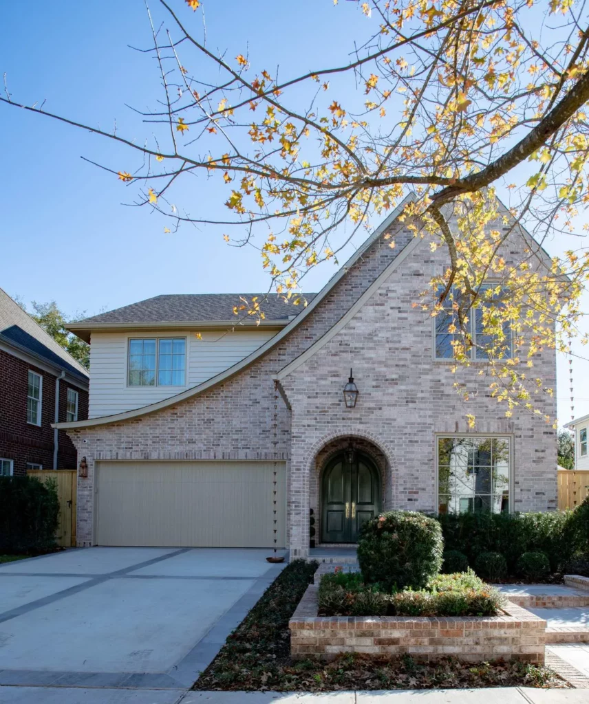
West University Place, Houston
Georgetown Residence
On a 50-foot West University lot, every room gets one thing that stands out while everything else pulls back.
Franco Albarran, Founder

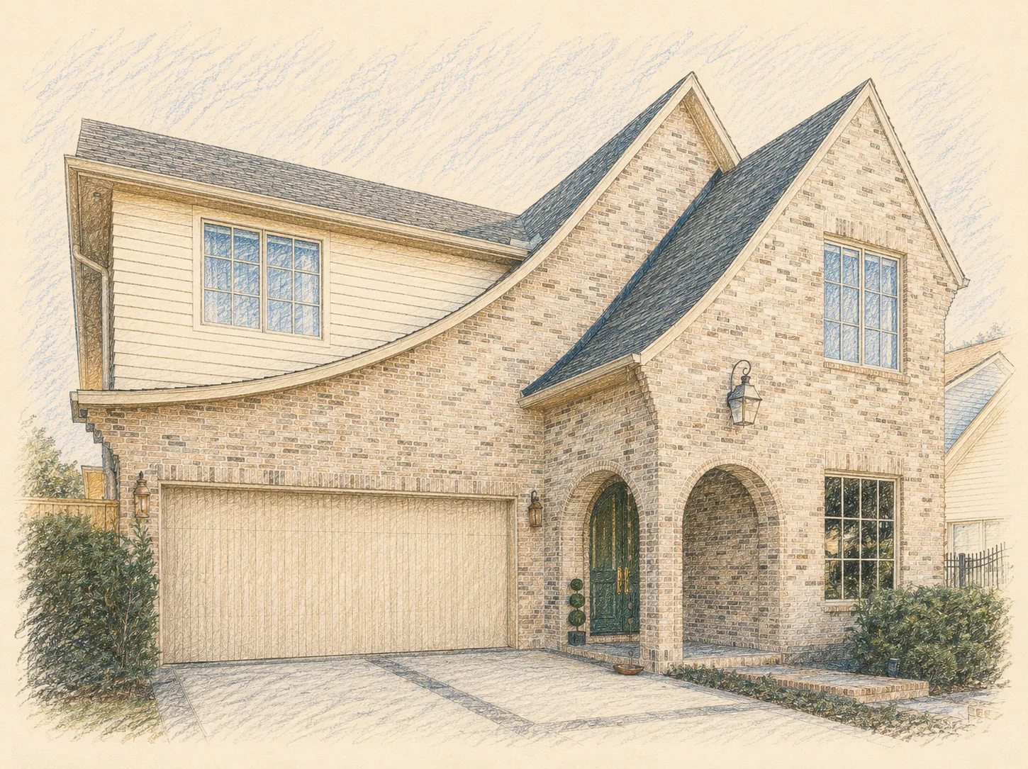
Tudor Made Modern
The client's older home was Tudor-ish, and they wanted that character carried into this one.
A steep gable sweeps down over the brick, and an arched entry echoes the arch on the house that stood here before. We kept the language close to the original without copying it.
Some people carry a house from their past into the next one. Is there one that still shapes what home looks like to you?
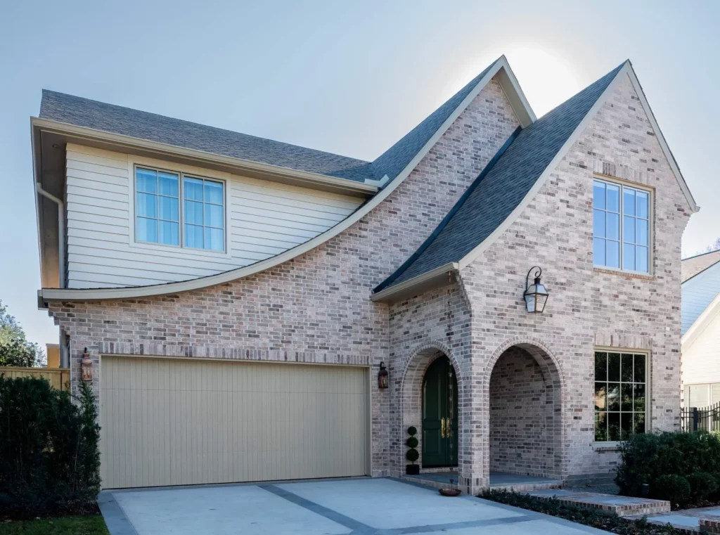
Layered Street Presence
This property is fifty feet wide, and most houses on a West University street that size push everything to the front and stack it two stories, one big box at the curb.
The client wanted the opposite. Here the two-story volume lands in front, steps back about ten feet at the garage, then layers deeper from there.
A house can announce itself at the curb or unfold as you approach. Which would you rather walk up to?
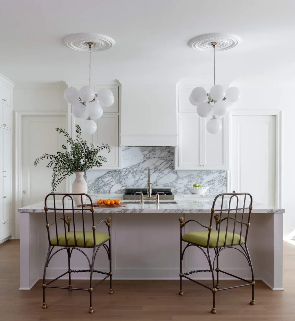
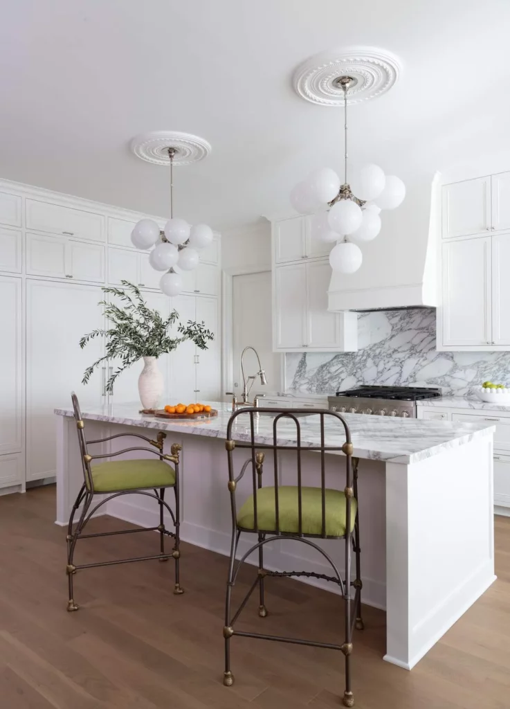
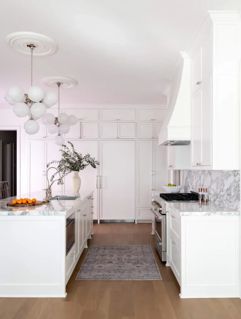
Marble at Center
In this kitchen, one material was meant to carry the room while everything else stepped back.
So we built the island from a single marble slab with strong veining, mitered at the edge so the grain wraps the corner. The fabricator and carpenter coordinated to fractions of an inch, and white inset cabinets stay quiet around it.
A kitchen reads calmer when one surface holds the eye. Which material in yours deserves that role?
Playful Overhead
Lighting is where the client let this kitchen get playful.
Clustered globe pendants hang over the island, set against New Orleans-style ceiling medallions. We painted the medallions flat so they read as texture under the light, not shine.
Most rooms have one element chosen purely for delight. Where would you put yours?
Molding Held Back
This house has the most molding we have ever used, and even here we pulled it back.
Heavier profiles against the ten-foot ceilings would have darkened the room, so we used inset cabinets with a thin applied molding at the base and a crown scaled to match. A refrigerator hides behind panels that continue the cabinet run.
A room can hold only so much detail before the detail starts to weigh on it. Where is that line in yours?
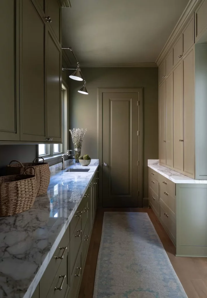
Prep That Disappears
From day one the client wanted a back kitchen for hosting: a place to prep and plate, then walk out as if the food had appeared.
We put a sink, an appliance garage, and the staging counter behind a pocket door, all painted one green at different sheens so the cabinets pop without a second color. Close the door and no one knows the room is there.
A space can feel finished even when guests never see it. Where in your home would that matter most to you?
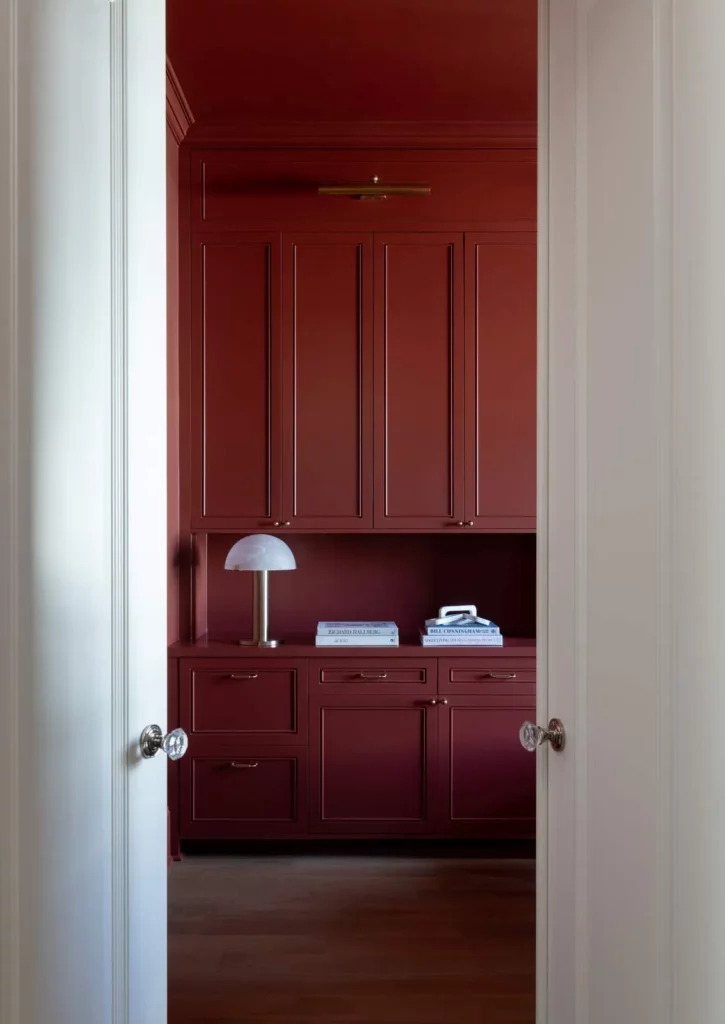
One Color, Every Sheen
This office belongs to an attorney, and the client wanted it to read masculine, like leather, cigar smoke, and a good bottle of scotch.
A color search that ran from navy to red landed on a deep red, painted across cabinets, walls, and ceiling at different sheens, with brass hardware to soften the dark tone. Before committing, the client signed off on full-size cabinet-door mockups painted in those candidate colors and sheens.
A room can be made to feel like the person who uses it. Which room in your home should feel most like you?
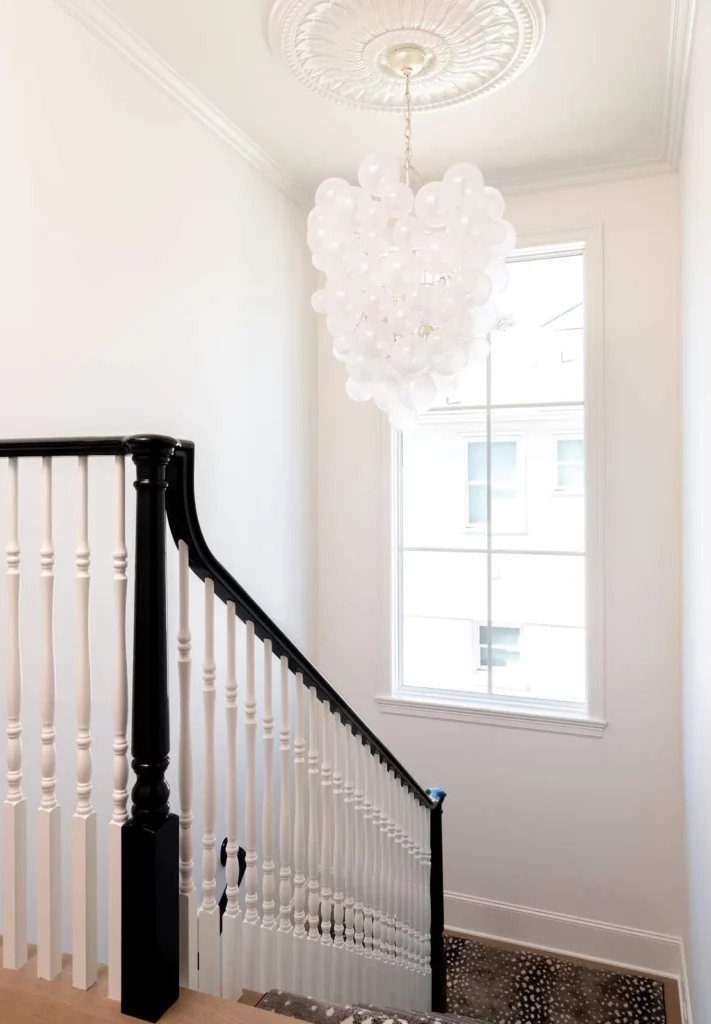
Stair as Foreshadowing
Downstairs reads white, and the client wanted one glossy black note somewhere in the house.
A handrail was the right place for it: white balusters frame a black rail, so nothing else on the stair competes, and the dark tone hints at the suite waiting upstairs.
One detail can set the tone for a whole staircase. Which element in yours is worth treating that way?
Bedroom Built to Measure
In this bedroom, the ceilings are nine feet rather than ten, and the room is sized for the furniture it holds, not for the square footage the property could have allowed.
So the client brought the bed frame to the site, and we set the side tables, measured the distances, and located the wall sconces at the height that worked for that bed. There was no staging: the flowers, the book, and the curtains are how the room looked the day we photographed it.
A bedroom can be drawn around square footage or around the actual furniture that will live in it. When would you bring that furniture into the conversation?
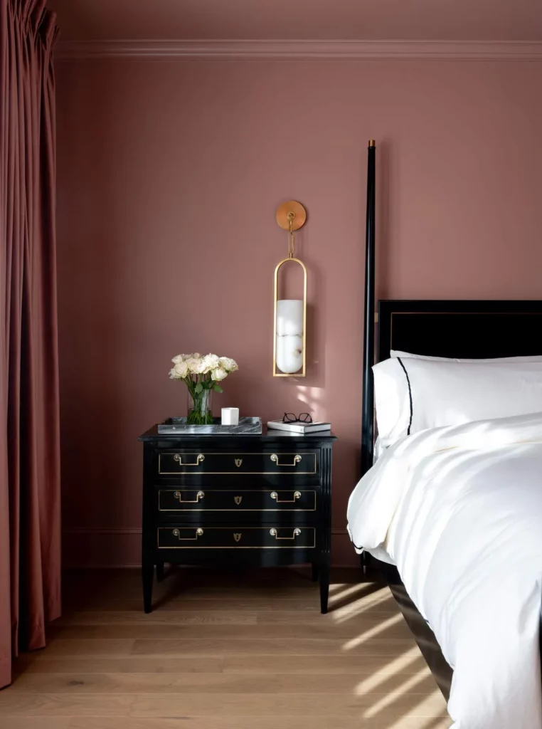
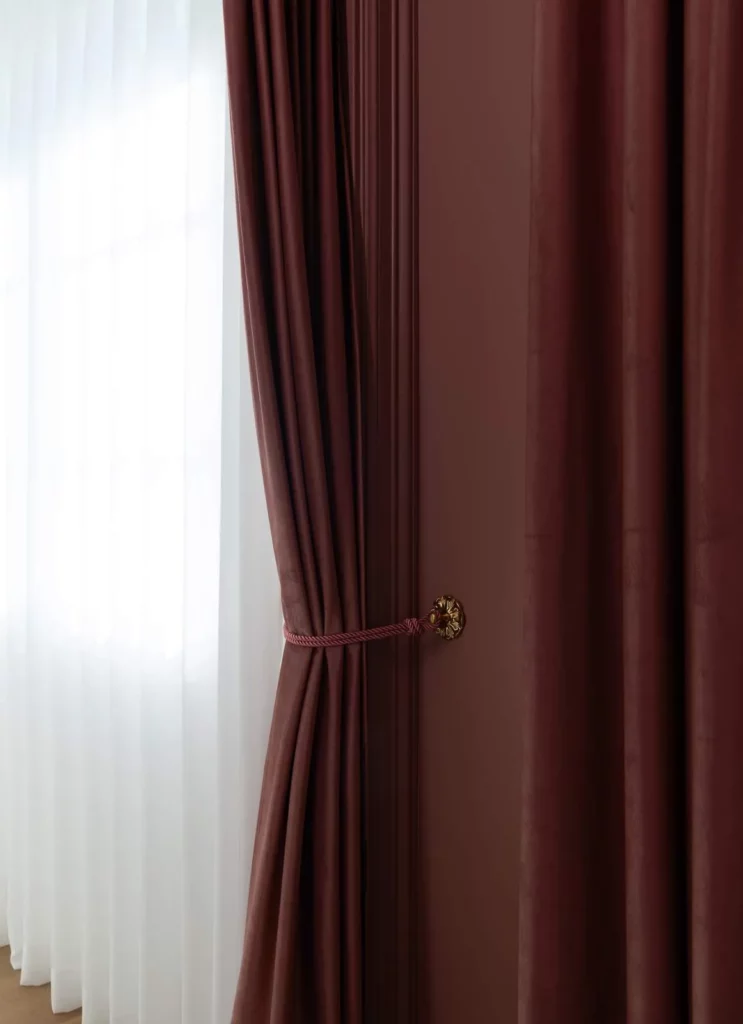
Wrapped in One Color
In a bedroom, color sets the mood before anything else does.
The walls here are a dusty rose the client found, a shade called hush-auburn, carried up to the crown, with velvet drapery in the same family layered over sheers so the light comes in soft.
A color can be the first thing you wake up inside of. What would yours be?
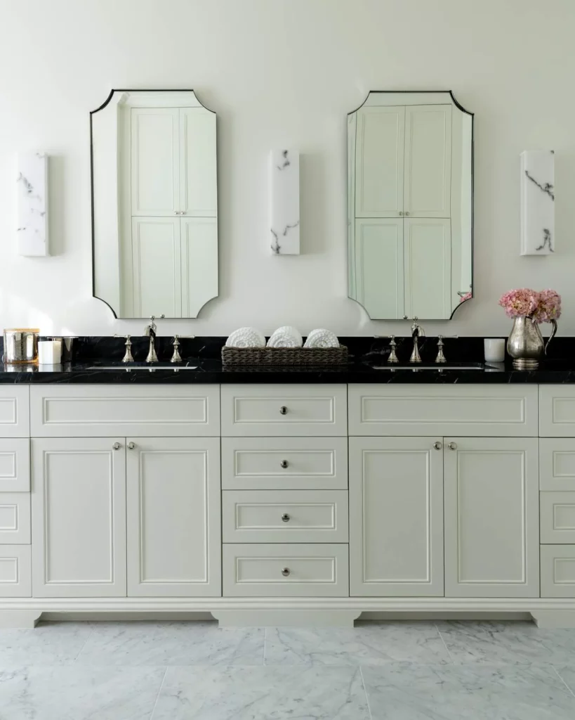
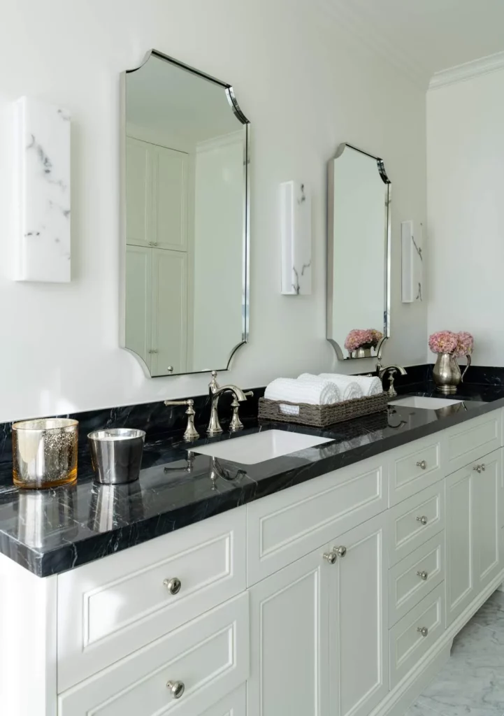
Black on White
In this bath, the client gave up square footage on purpose, to keep the scale of the house appropriate.
The vanity pairs a black countertop with soft white cabinets, a tuxedo contrast like the white-glove look of a good hotel, in a room sized for how it is used.
A bathroom does not have to be large to feel considered. Where would you trade size for that feeling?
Everything Else Pulls Back
A black countertop was meant to hold the eye here, so everything around it had to stay quiet.
So the cabinets carry the same inset design used through the rest of the house, here in soft white, and the scalloped mirrors, marble sconces, and marble floor all stay low-key.
In any room, some details should recede so one can speak. What in yours would you be willing to quiet down?
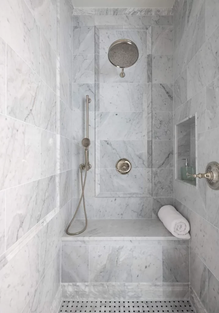
Valve at the Door
A shower valve usually sits under the head, which means walking into a cold spray to turn the water on.
So during the framing walkthrough we moved the valve to the right, just inside the door, where the client can start the water and let it warm before stepping in. This is a shared shower, and the control on the opposite side works the same way.
Some of the decisions you feel most each day are the ones you never see. Which of yours would you most want gotten right?
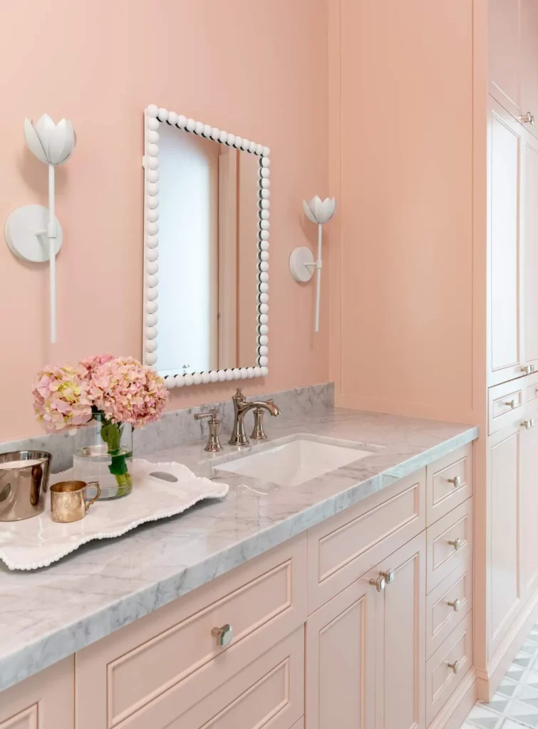
Pink Without the Costume
The client and their two daughters all love pink, and the question was how to use it so the room felt considered, not like a costume.
We kept the same inset cabinet design used through the house and let the playfulness sit in the details: a soft pink, flower-shaped white wall sconces, and beaded-frame mirrors. Full-size mockups in candidate colors and sheens let the client and their designers commit.
An expressive room can still belong to the whole house. What would it take for one of yours to do both?
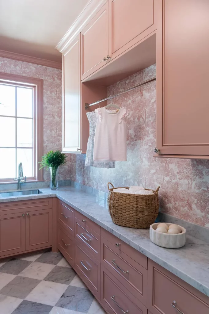
Laundry Worth Loving
The client did not want a white box with a fluorescent fixture, since if they had to do laundry, they wanted to enjoy the room.
So we paired pink cabinets with a scenic wallpaper and marble counters, and when the supplier shipped floor tile in two slightly different shades, our installer worked out a light-and-dark checkerboard on-site that the client approved by text before the floor was done.
A working room is easy to leave plain. Is there one in your home worth the extra design?
Client Stories
What it's like to build with Franco
A foundation of trust
“He was the first person in this industry we felt we could trust.”
Georgetown Residence